I made six code-drawn concepts and compared them on light and dark sheets. I exported the kit for #4, the swatch fan. I looked at both sheets and the kit preview board.
Rejected
- #1 phone, #2 sun/horizon, #3 overlap, #6 monogram: their dark ink disappears on the dark sheet. Only the coral dot, sun or crescent is left, and the shapes that give them meaning are gone. They would need a plate or a separate dark variant.
- #6: it is also an "H", not a "P". That's a mistake for Paletta.
Shortlist
-
#4 swatch fan (teal, yellow and coral cards) is the pick.
- Name fit: it reads as a paint-chip fan, which is a palette.
- Tone: the rounded cards are friendly and minimal, with no purple.
- Themes: the colors work on both light and dark backgrounds with no changes.
- At 16px: the silhouette is gone, and the pale highlight tab and the card edges turn to mush. What's left is three colored stripes, a small rainbow-like flag. That's recognizable as color but not as swatches. On the light plate in the kit's favicon it holds up better than bare on the sheet, but it is the weakest part of this mark. It reads fine at 32px and up.
- Risk: a swatch fan is a common idea, so check it for similarity before launch.
-
#5 block light (a dark rounded square with a coral quarter-circle and dot) is the runner-up.
- At 16px: it is the best of the six. The solid plate keeps the shape, and the coral shapes stay visible.
- Themes: it works on both backgrounds because it carries its own plate.
- Weakness: it says nothing about palettes or wallpapers. It could be any app icon, so it is safe but generic.
Kit for #4 is in kit/: mark.png, mark-black.png, mark-white.png, lockup-light.png, lockup-dark.png, favicon.ico, apple-touch-icon.png, icon-512.png, og-1200x630.png and preview.png.
- Raster only: these are PNGs, not vector files. Redraw the mark as SVG before using it in production.
- OG image: its background is a deep navy. It isn't purple, but check it if you want to avoid any violet cast.
- Before launch: run a reverse image search and a trademark search on the mark and the name "Paletta".
If you want a stronger 16px favicon, I can make a simplified two-card version, or use #5's plate approach for the small sizes only.
One real run in an isolated temp folder with only this skill installed. The agent could use Skill, Read and three allow-listed scripts (shapes.py, contact_sheet.py, export_kit.py); no general shell, no network. It ran the code-drawn path only: concepts, comparison sheets and kit export. The AI concept path (ComfyUI + FLUX 3 Klein) was not part of this run. Output is shown verbatim, including its own criticism of the weakest concepts.
Qué hace
Guía al agente para diseñar un logotipo de marca explorando varios conceptos distintos a la vez y terminando el elegido con código.
Cómo funciona
- Pide un resumen de requisitos: nombre y significado, tono, paleta y a qué no debe parecerse el logotipo.
- Crea seis conceptos desde enfoques distintos: conceptos de IA con ComfyUI + FLUX 3 Klein en local y formas geométricas precisas dibujadas con Pillow.
- Los reúne en una hoja comparativa con fondos claros y oscuros y vistas a 64/32/16px, y descarta los débiles explicando los motivos.
- Redibuja el elegido con formas exactas y exporta el kit: siluetas blancas y negras, composiciones para fondos claros y oscuros, favicon.ico, apple-touch-icon, icono de 512px e imagen OG de 1200x630.
Ejemplos
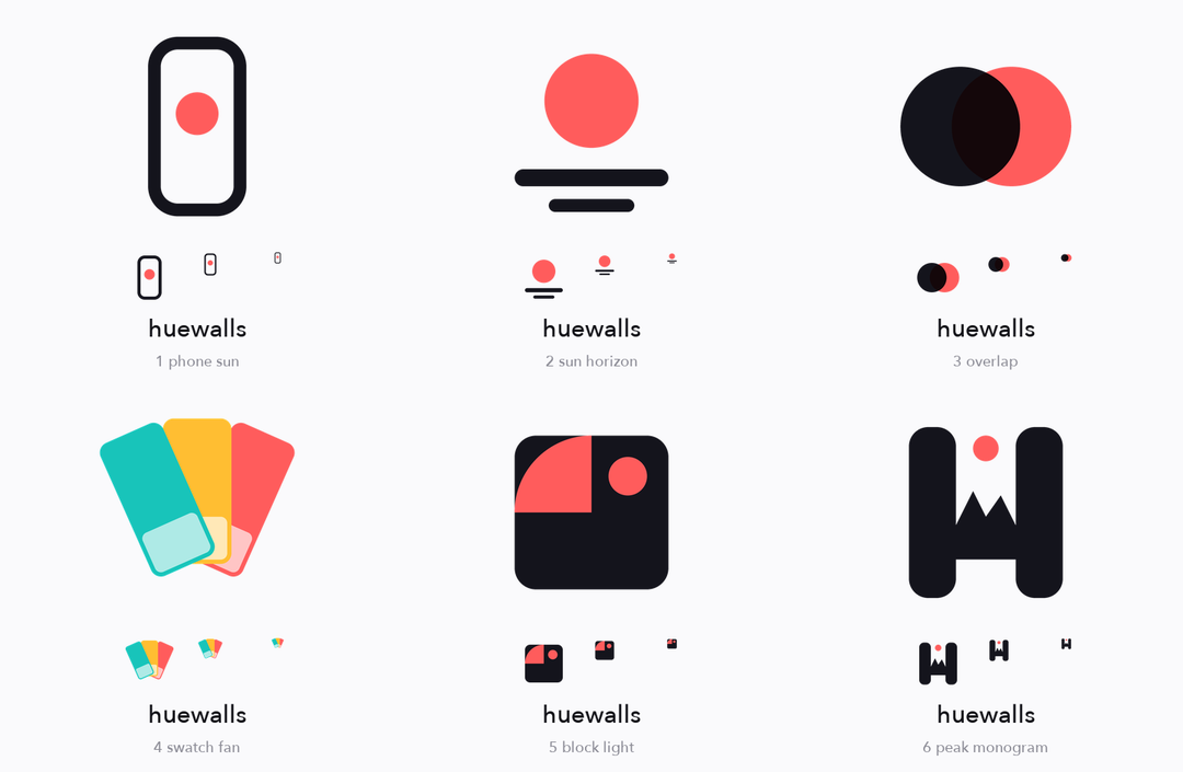
Conceptos dibujados con código sobre fondo claro, con vistas a 64/32/16px
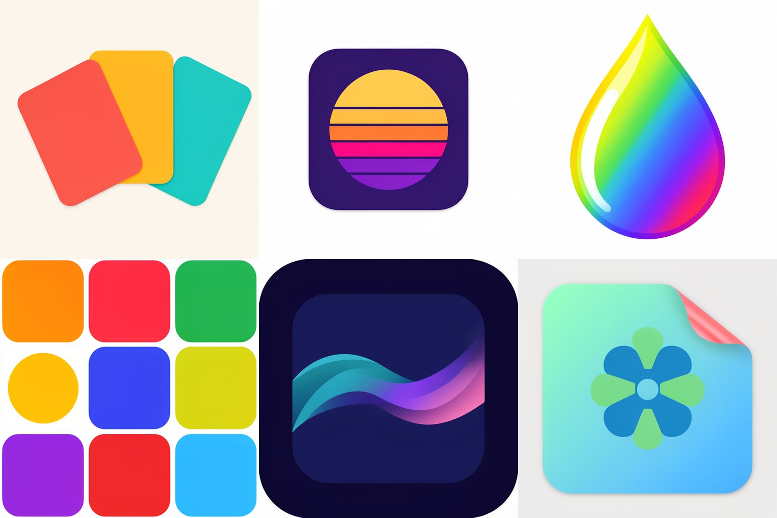
Seis conceptos de IA con FLUX 3 Klein, una idea por prompt: algunos funcionan y otros fallan
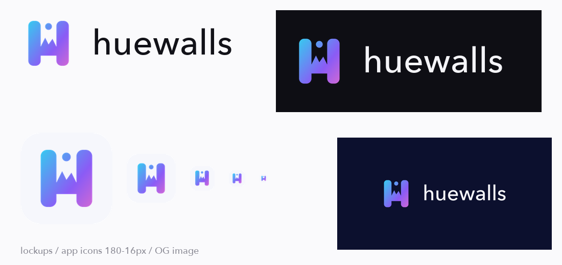
Kit exportado a partir de una marca elegida
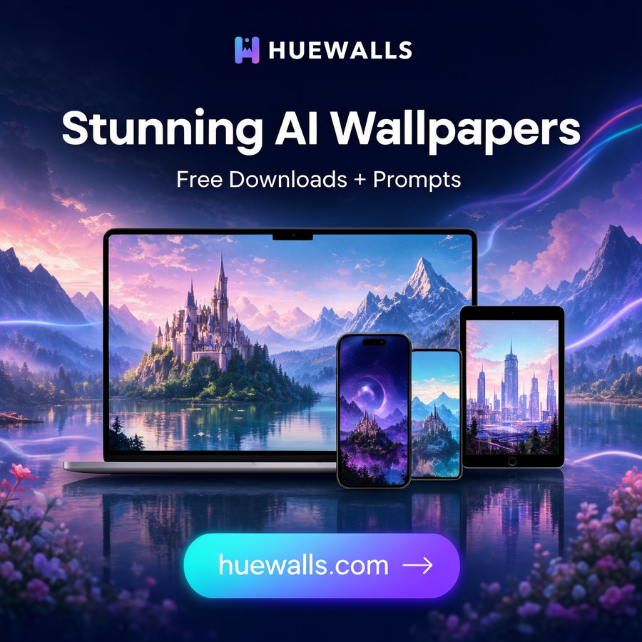
La marca aplicada a un anuncio en redes sociales
Para qué sirve
Fundadores y desarrolladores que necesitan un logotipo, favicon e imagen para compartir con rapidez y quieren elegir entre direcciones distintas, en lugar de variaciones de una misma idea.
Riesgo medio: contiene 5 scripts Python que escriben imágenes en las carpetas elegidas y envían solicitudes HTTP a un servidor ComfyUI local (127.0.0.1:8188 por defecto; se cambia con COMFY_URL). No lee secretos, no elimina nada ni realiza otras conexiones. Un agente lo probó una vez en una carpeta aislada, con solo tres scripts permitidos, usando la vía de dibujo con código: conceptos, comparación y exportación. La vía de IA (ComfyUI + FLUX 3 Klein) no formó parte de esa prueba y solo la ejecutó el autor en macOS. Necesita Python con Pillow y numpy; comprueba la licencia del modelo FLUX para tu uso. No demuestra que el logotipo sea único: realiza búsquedas inversas de imágenes y de marcas antes del lanzamiento.