I made six code-drawn concepts and compared them on light and dark sheets. I exported the kit for #4, the swatch fan. I looked at both sheets and the kit preview board.
Rejected
- #1 phone, #2 sun/horizon, #3 overlap, #6 monogram: their dark ink disappears on the dark sheet. Only the coral dot, sun or crescent is left, and the shapes that give them meaning are gone. They would need a plate or a separate dark variant.
- #6: it is also an "H", not a "P". That's a mistake for Paletta.
Shortlist
-
#4 swatch fan (teal, yellow and coral cards) is the pick.
- Name fit: it reads as a paint-chip fan, which is a palette.
- Tone: the rounded cards are friendly and minimal, with no purple.
- Themes: the colors work on both light and dark backgrounds with no changes.
- At 16px: the silhouette is gone, and the pale highlight tab and the card edges turn to mush. What's left is three colored stripes, a small rainbow-like flag. That's recognizable as color but not as swatches. On the light plate in the kit's favicon it holds up better than bare on the sheet, but it is the weakest part of this mark. It reads fine at 32px and up.
- Risk: a swatch fan is a common idea, so check it for similarity before launch.
-
#5 block light (a dark rounded square with a coral quarter-circle and dot) is the runner-up.
- At 16px: it is the best of the six. The solid plate keeps the shape, and the coral shapes stay visible.
- Themes: it works on both backgrounds because it carries its own plate.
- Weakness: it says nothing about palettes or wallpapers. It could be any app icon, so it is safe but generic.
Kit for #4 is in kit/: mark.png, mark-black.png, mark-white.png, lockup-light.png, lockup-dark.png, favicon.ico, apple-touch-icon.png, icon-512.png, og-1200x630.png and preview.png.
- Raster only: these are PNGs, not vector files. Redraw the mark as SVG before using it in production.
- OG image: its background is a deep navy. It isn't purple, but check it if you want to avoid any violet cast.
- Before launch: run a reverse image search and a trademark search on the mark and the name "Paletta".
If you want a stronger 16px favicon, I can make a simplified two-card version, or use #5's plate approach for the small sizes only.
One real run in an isolated temp folder with only this skill installed. The agent could use Skill, Read and three allow-listed scripts (shapes.py, contact_sheet.py, export_kit.py); no general shell, no network. It ran the code-drawn path only: concepts, comparison sheets and kit export. The AI concept path (ComfyUI + FLUX 3 Klein) was not part of this run. Output is shown verbatim, including its own criticism of the weakest concepts.
它做什么
带着代理设计品牌 logo:不是反复打磨一个方案,而是一次探索多个不同的方向,选出最好的再用代码定稿。
工作方式
- 先问一份简短的需求:名字和含义、风格、配色、logo 不能像什么。
- 从不同角度做六个概念:用本机 ComfyUI + FLUX 3 Klein 生成 AI 概念,再用 Pillow 画精确的几何概念。
- 放进同一张对比图,带深浅两种底色和 64/32/16 像素预览,并写明淘汰理由。
- 把选中的概念重画成精确图形,导出整套:黑白剪影、深浅两版字标、favicon.ico、apple-touch-icon、512 像素图标和 1200x630 的 OG 图。
案例
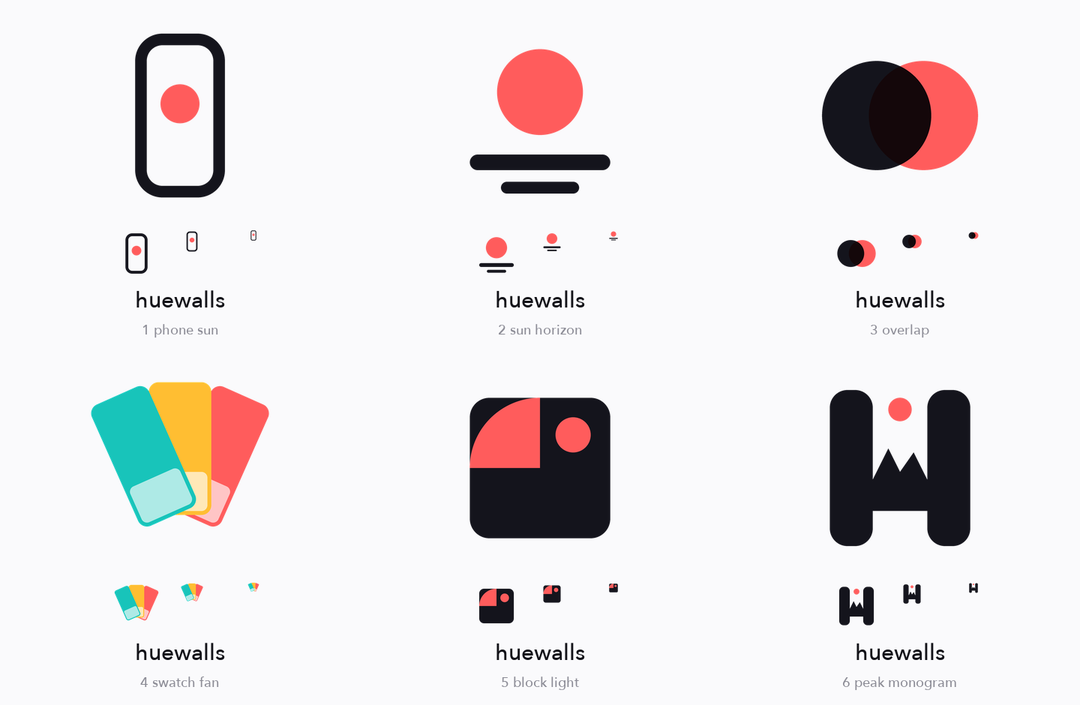
代码绘制的概念,浅色底对比,带 64/32/16 像素预览
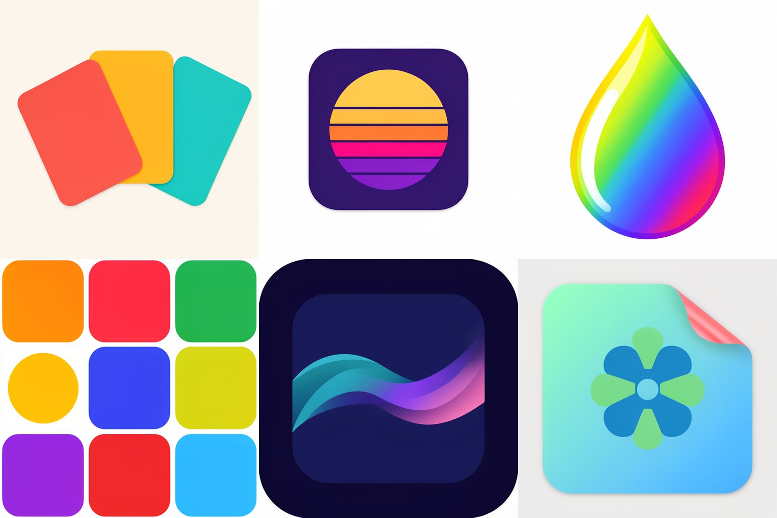
FLUX 3 Klein 生成的六个 AI 概念,每个提示词只含一个想法,有成功也有失败
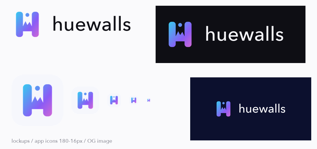
用选定标志生成的整套导出文件
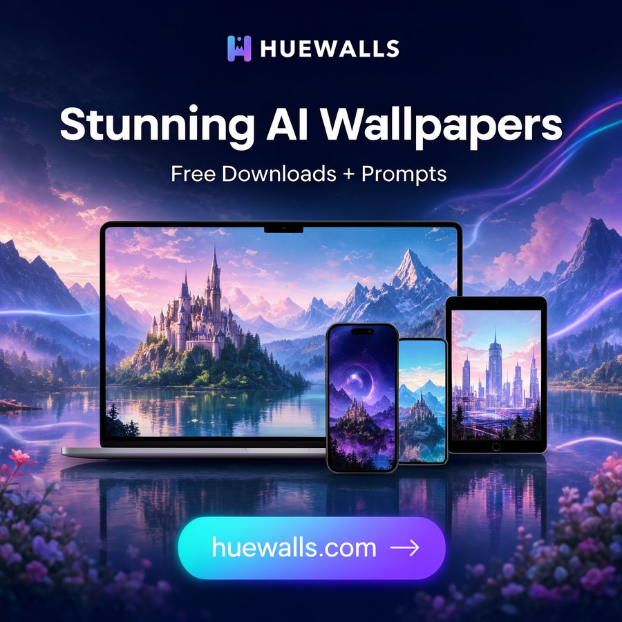
标志用在社交广告里的效果
适合谁
需要快速拿到 logo、favicon 和分享图的创业者和开发者,并且希望看到几个真正不同的方向,而不是同一个想法的几个变体。
中风险:包含 5 个 Python 脚本,会把图片文件写入你指定的目录,并向你本机的 ComfyUI 服务发送 HTTP 请求(默认 127.0.0.1:8188,可用 COMFY_URL 修改)。不读取密钥、不删除任何文件,除此之外不联网。已由代理在隔离目录里试用一次,只放行三个脚本,走的是代码绘制路径(概念、对比图、导出套件);AI 路径(ComfyUI + FLUX 3 Klein)不在这次试用范围内,只由作者在 macOS 上单独运行过。需要安装了 Pillow 和 numpy 的 Python;FLUX 模型的授权请自行确认是否适用于你的用途。它无法证明 logo 是唯一的:上线前请自行做以图搜图和商标检索。