I made six code-drawn concepts and compared them on light and dark sheets. I exported the kit for #4, the swatch fan. I looked at both sheets and the kit preview board.
Rejected
- #1 phone, #2 sun/horizon, #3 overlap, #6 monogram: their dark ink disappears on the dark sheet. Only the coral dot, sun or crescent is left, and the shapes that give them meaning are gone. They would need a plate or a separate dark variant.
- #6: it is also an "H", not a "P". That's a mistake for Paletta.
Shortlist
-
#4 swatch fan (teal, yellow and coral cards) is the pick.
- Name fit: it reads as a paint-chip fan, which is a palette.
- Tone: the rounded cards are friendly and minimal, with no purple.
- Themes: the colors work on both light and dark backgrounds with no changes.
- At 16px: the silhouette is gone, and the pale highlight tab and the card edges turn to mush. What's left is three colored stripes, a small rainbow-like flag. That's recognizable as color but not as swatches. On the light plate in the kit's favicon it holds up better than bare on the sheet, but it is the weakest part of this mark. It reads fine at 32px and up.
- Risk: a swatch fan is a common idea, so check it for similarity before launch.
-
#5 block light (a dark rounded square with a coral quarter-circle and dot) is the runner-up.
- At 16px: it is the best of the six. The solid plate keeps the shape, and the coral shapes stay visible.
- Themes: it works on both backgrounds because it carries its own plate.
- Weakness: it says nothing about palettes or wallpapers. It could be any app icon, so it is safe but generic.
Kit for #4 is in kit/: mark.png, mark-black.png, mark-white.png, lockup-light.png, lockup-dark.png, favicon.ico, apple-touch-icon.png, icon-512.png, og-1200x630.png and preview.png.
- Raster only: these are PNGs, not vector files. Redraw the mark as SVG before using it in production.
- OG image: its background is a deep navy. It isn't purple, but check it if you want to avoid any violet cast.
- Before launch: run a reverse image search and a trademark search on the mark and the name "Paletta".
If you want a stronger 16px favicon, I can make a simplified two-card version, or use #5's plate approach for the small sizes only.
One real run in an isolated temp folder with only this skill installed. The agent could use Skill, Read and three allow-listed scripts (shapes.py, contact_sheet.py, export_kit.py); no general shell, no network. It ran the code-drawn path only: concepts, comparison sheets and kit export. The AI concept path (ComfyUI + FLUX 3 Klein) was not part of this run. Output is shown verbatim, including its own criticism of the weakest concepts.
できること
1つの案を磨くのではなく、まず多くの異なる方向を同時に探り、選んだ案をコードで仕上げる流れをエージェントに案内させます。
進め方
- 短い要件を確認:名前と意味、トーン、配色、似てはいけないもの。
- 異なる切り口で6案を作成:ローカルの ComfyUI + FLUX 3 Klein による AI 案と、Pillow で描く正確な幾何学案。
- 明暗の背景と 64/32/16px のプレビュー付きの比較シートに並べ、落とす理由を明記して絞り込みます。
- 選んだ案を正確な図形で描き直し、白黒シルエット、明暗2種の横型ロゴ、favicon.ico、apple-touch-icon、512px アイコン、1200x630 の OG 画像を書き出します。
実例
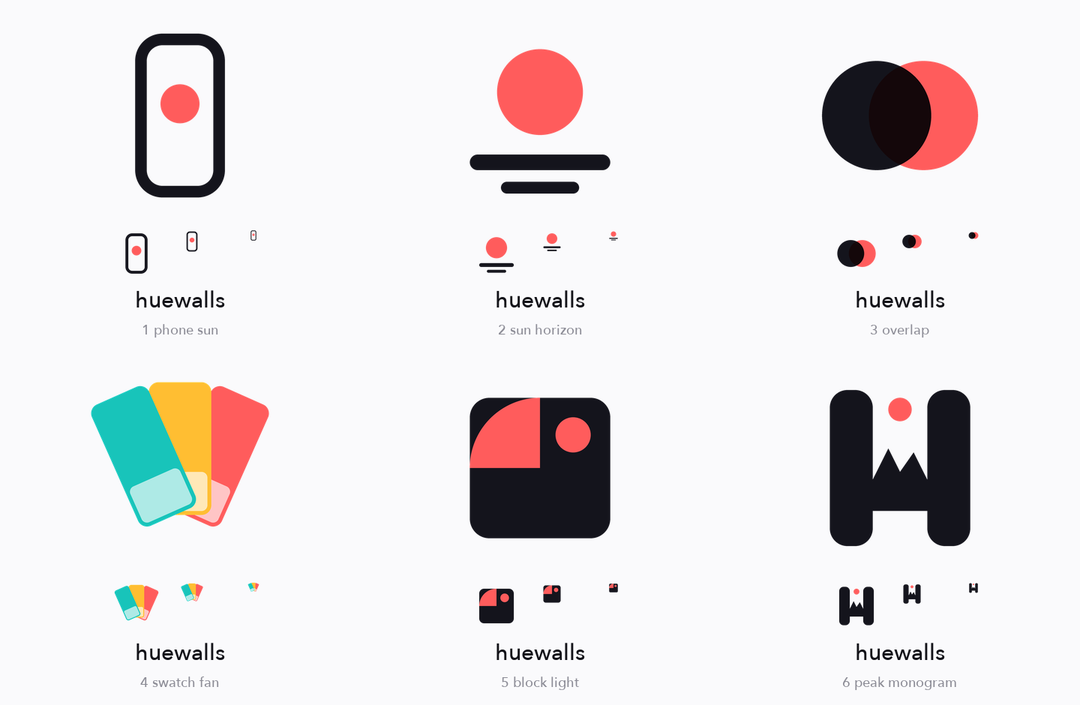
コードで描いた案を明るい背景で比較(64/32/16px プレビュー付き)
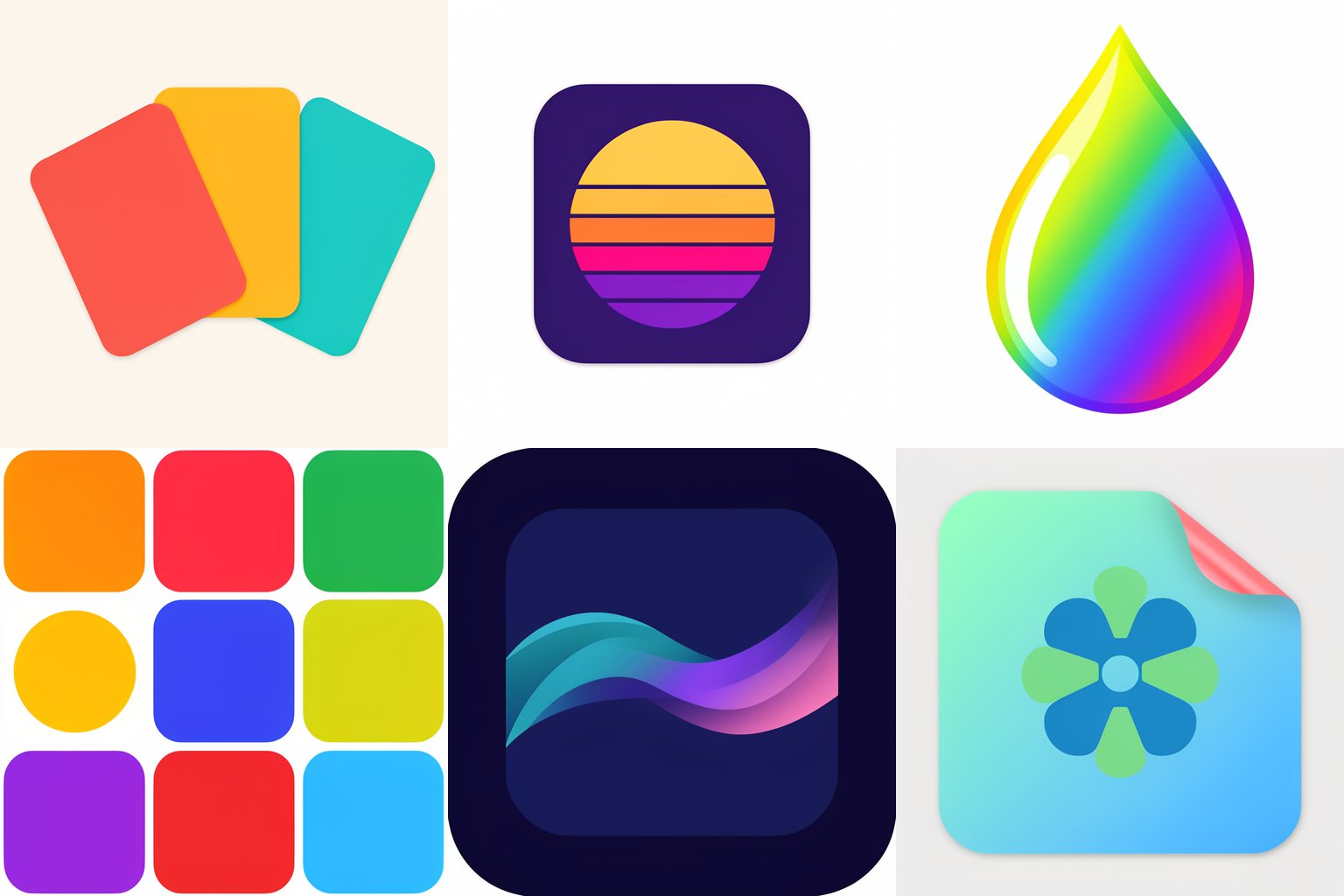
FLUX 3 Klein による6つの AI 案。1プロンプト1アイデアで、成功も失敗もあります
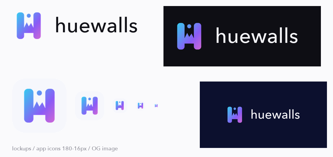
選んだマークから生成した書き出しセット
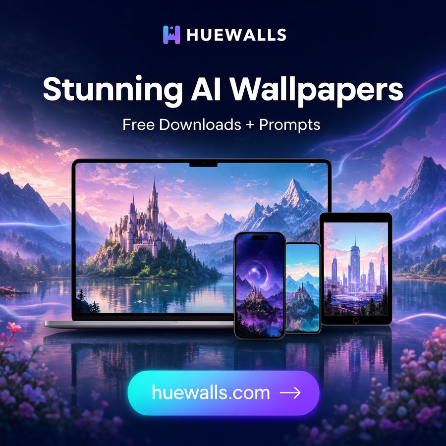
ソーシャル広告でのマークの使用例
こんな方に
ロゴ・favicon・シェア画像を素早く用意したい創業者や開発者で、1つの案の派生ではなく、本当に異なる方向から選びたい方。
中リスク:Python スクリプトが5つ含まれ、指定したフォルダに画像ファイルを書き込み、お使いのマシン上の ComfyUI サーバー(既定 127.0.0.1:8188、COMFY_URL で変更可)に HTTP リクエストを送ります。秘密情報の読み取りやファイル削除はなく、それ以外の通信もありません。エージェントが隔離フォルダで3つのスクリプトのみを許可して1回試用しました(コード描画の経路:案の作成、比較シート、書き出し)。AI の経路(ComfyUI + FLUX 3 Klein)はこの試用に含まれず、作者が macOS で別途実行しただけです。Pillow と numpy を入れた Python が必要です。FLUX モデルのライセンスが用途に合うか各自でご確認ください。ロゴの独自性は証明できません。公開前に画像検索と商標検索を行ってください。