I made six code-drawn concepts and compared them on light and dark sheets. I exported the kit for #4, the swatch fan. I looked at both sheets and the kit preview board.
Rejected
- #1 phone, #2 sun/horizon, #3 overlap, #6 monogram: their dark ink disappears on the dark sheet. Only the coral dot, sun or crescent is left, and the shapes that give them meaning are gone. They would need a plate or a separate dark variant.
- #6: it is also an "H", not a "P". That's a mistake for Paletta.
Shortlist
-
#4 swatch fan (teal, yellow and coral cards) is the pick.
- Name fit: it reads as a paint-chip fan, which is a palette.
- Tone: the rounded cards are friendly and minimal, with no purple.
- Themes: the colors work on both light and dark backgrounds with no changes.
- At 16px: the silhouette is gone, and the pale highlight tab and the card edges turn to mush. What's left is three colored stripes, a small rainbow-like flag. That's recognizable as color but not as swatches. On the light plate in the kit's favicon it holds up better than bare on the sheet, but it is the weakest part of this mark. It reads fine at 32px and up.
- Risk: a swatch fan is a common idea, so check it for similarity before launch.
-
#5 block light (a dark rounded square with a coral quarter-circle and dot) is the runner-up.
- At 16px: it is the best of the six. The solid plate keeps the shape, and the coral shapes stay visible.
- Themes: it works on both backgrounds because it carries its own plate.
- Weakness: it says nothing about palettes or wallpapers. It could be any app icon, so it is safe but generic.
Kit for #4 is in kit/: mark.png, mark-black.png, mark-white.png, lockup-light.png, lockup-dark.png, favicon.ico, apple-touch-icon.png, icon-512.png, og-1200x630.png and preview.png.
- Raster only: these are PNGs, not vector files. Redraw the mark as SVG before using it in production.
- OG image: its background is a deep navy. It isn't purple, but check it if you want to avoid any violet cast.
- Before launch: run a reverse image search and a trademark search on the mark and the name "Paletta".
If you want a stronger 16px favicon, I can make a simplified two-card version, or use #5's plate approach for the small sizes only.
One real run in an isolated temp folder with only this skill installed. The agent could use Skill, Read and three allow-listed scripts (shapes.py, contact_sheet.py, export_kit.py); no general shell, no network. It ran the code-drawn path only: concepts, comparison sheets and kit export. The AI concept path (ComfyUI + FLUX 3 Klein) was not part of this run. Output is shown verbatim, including its own criticism of the weakest concepts.
무엇을 하나요
하나의 안을 다듬는 대신 여러 가지 다른 방향을 동시에 탐색하고, 고른 안을 코드로 마무리하도록 에이전트를 안내합니다.
진행 방식
- 간단한 요구사항을 먼저 확인: 이름과 의미, 분위기, 색상, 닮으면 안 되는 대상.
- 서로 다른 관점에서 시안 여섯 개 제작: 로컬 ComfyUI + FLUX 3 Klein으로 AI 시안, Pillow로 정밀한 기하 시안.
- 밝은/어두운 배경과 64/32/16px 미리보기를 넣은 비교 시트에 올려 놓고, 탈락 이유를 밝히며 추립니다.
- 선택한 안을 정확한 도형으로 다시 그려 흑백 실루엣, 밝은/어두운 가로형 로고, favicon.ico, apple-touch-icon, 512px 아이콘, 1200x630 OG 이미지를 내보냅니다.
예시
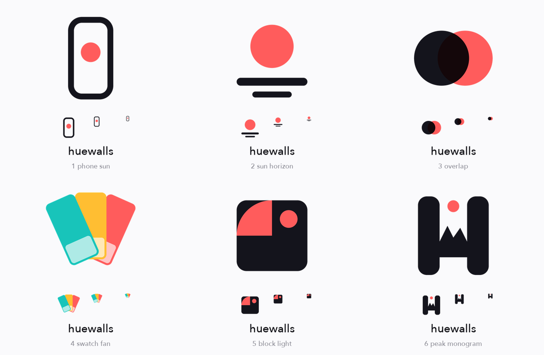
코드로 그린 시안을 밝은 배경에서 비교 (64/32/16px 미리보기 포함)
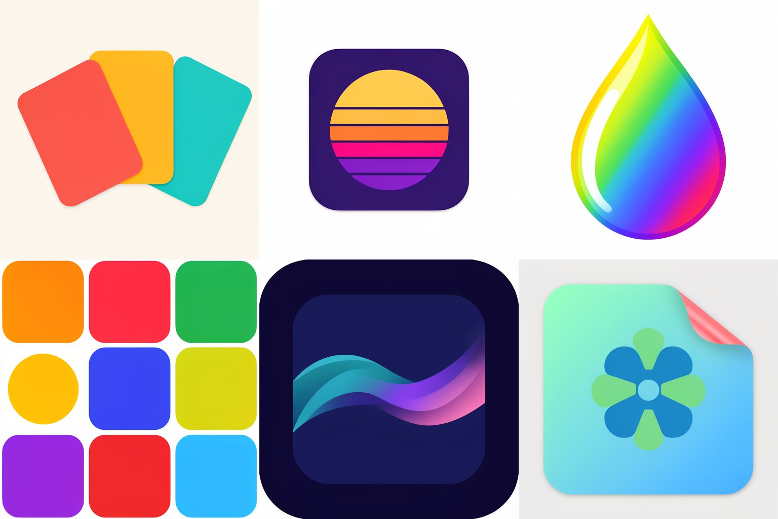
FLUX 3 Klein이 만든 AI 시안 여섯 개. 프롬프트마다 하나의 아이디어, 성공도 실패도 있습니다
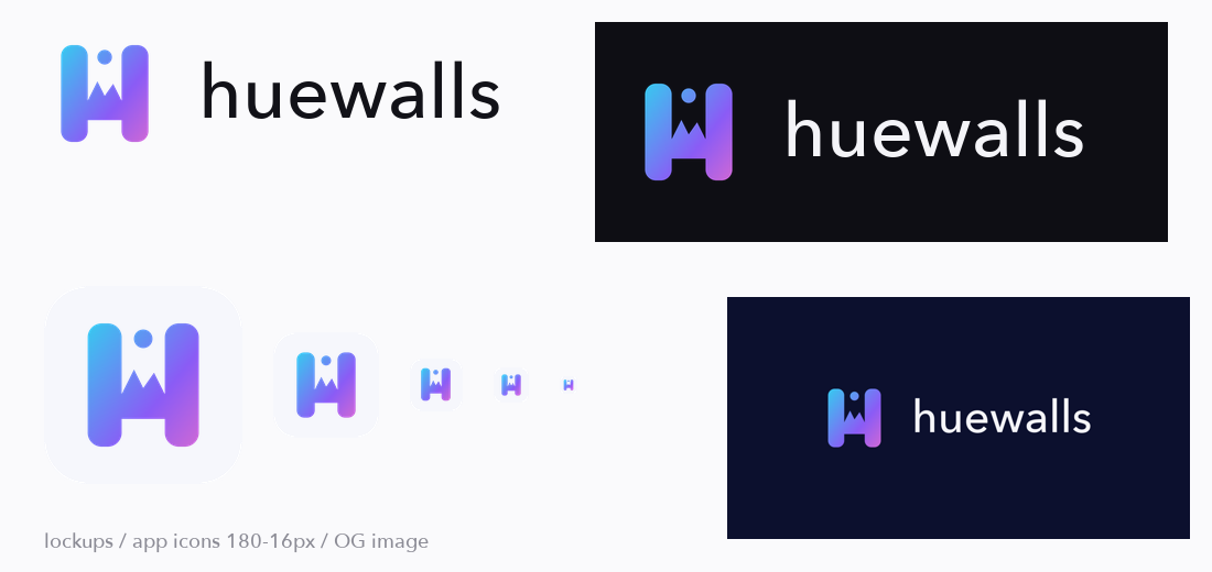
선택한 마크로 생성한 내보내기 세트
소셜 광고에 쓰인 마크
이런 분께
로고, favicon, 공유 이미지를 빠르게 만들고 싶은 창업자와 개발자로, 하나의 아이디어를 변형한 것이 아닌 정말 다른 방향 중에서 고르고 싶은 분.
중간 위험: Python 스크립트 5개가 포함되어 있으며, 지정한 폴더에 이미지 파일을 쓰고 사용자의 컴퓨터에서 실행 중인 ComfyUI 서버(기본 127.0.0.1:8188, COMFY_URL로 변경)에 HTTP 요청을 보냅니다. 비밀 정보를 읽거나 파일을 삭제하지 않으며, 그 외의 네트워크 접속도 없습니다. 에이전트가 격리된 폴더에서 허용된 스크립트 3개만 사용해 코드 드로잉 경로(시안 생성, 비교 시트, 키트 내보내기)로 한 번 시험 실행했습니다. AI 경로(ComfyUI + FLUX 3 Klein)는 이 시험에 포함되지 않았고, 작성자가 macOS에서 따로 실행해 보았을 뿐입니다. Pillow와 numpy가 설치된 Python이 필요하며, FLUX 모델의 라이선스가 용도에 맞는지 직접 확인하세요. 로고의 고유성은 증명할 수 없으니 출시 전에 이미지 검색과 상표 검색을 해 보세요.